Logo Gallery Block
The Logo Gallery Template defines the HTML structure and content displayed within the Gutenberg editor for the Logo Gallery Block. It is responsible for displaying a heading, an optional excerpt, and a gallery of logos.
Content Editor Fields
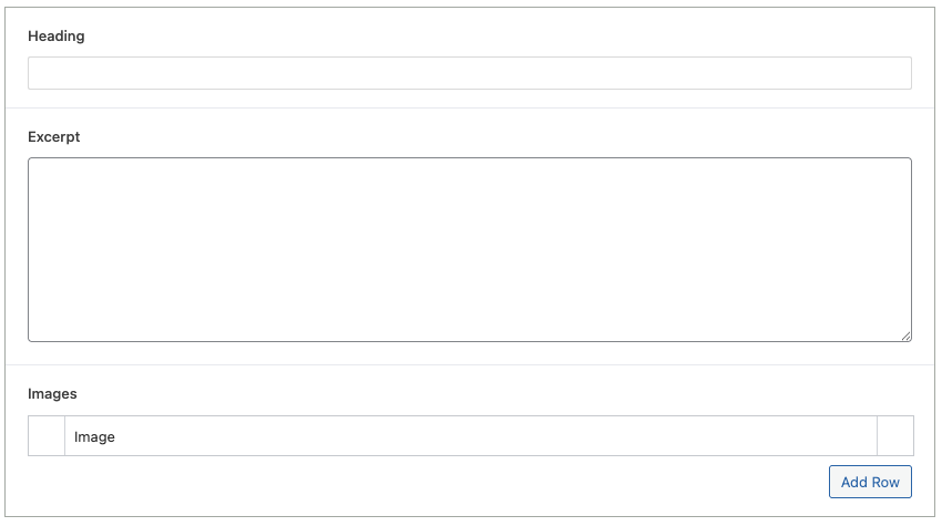
Heading
- Description: The main heading text displayed above the logo gallery.
- Usage: Use this field to provide a clear title for the section.
- Optional: If no heading is provided, this element will not be displayed.
Excerpt
- Description: A short description or paragraph of text displayed below the heading.
- Usage: Use this field to provide more context or information about the logo gallery.
- Optional: If no excerpt is provided, this element will not be displayed.
Images
- Description: A list of images to be displayed as logos in the gallery.
- Usage: Use this field to add and manage the logo images.
- Mandatory: This field is mandatory. If no images are added, the block will not display any logo.
Example Usage:
Steps:
- Add the block: Insert the Logo Gallery Block into your page or post.
- Fill the fields:
- In the block settings, fill the "Heading" field.
- In the block settings, fill the "Excerpt" field.
- In the block settings, add the images in the "Images" field.
- Save the Block: Your Logo Gallery block is now ready for display!
Result:
When properly configured, the Logo Gallery Block will render a section with a heading, an optional excerpt, and a gallery of logos.
Preview in the editor (body):

Customization:
You can customize the Logo Gallery Block display in the following ways:
- Content Customization: Change the heading and excerpt text directly within the block settings.
- Images Customization: Change the images in the "Images" field.
Benefits:
- Clear Structure: The template provides a simple and organized HTML structure.
- Dynamic Content: The template allows for dynamic content to be inserted.
- Easy to Use: It is simple to configure for the end user.
- Multiple logos: You can add multiple logos.

